Typography today, based upon the most commonly occurring letters in the English language:

ETAOINSHRD 28-10-13It was fun to play around with transparencies here but on this occasion I think I played it a little too safe and ought to have made the contrast between each layer greater, and perhaps added an outline for further clarity. Something to learn for future works of this type, I think.


There’ve been a couple of moments of panic in various arenas of life in the last couple of days and the latest scares about the heavy oncoming storms have sealed it. With that in mind, here is a headless chicken:

Headless Chicken 27-10-13

For whatever reason the idea of a chicken shrieking very genteel curses really tickles me. I wish I’d roughed up the outline a little more but I like the overall composition and the black/white keeps it simple.

Unexpected sabbatical last night, so here are yesterday’s drawing and today’s, both of which see a return to long-unused media; the former is an ink painting of a sock monkey:

Sock Monkey 25-10-13

I think this fellow’s rather charming. I’ve been thinking a lot about sock monkeys for a future undertaking which I’ll explain more once I can get certain elements confirmed.


The latter is a biro sketch of stem ginger:

Stem Ginger 26-10-13

I think the scratchiness of the biro depicts the roughness of the ginger quite nicely. Having said that, of the two images I much prefer the monkey.


An attempt to show glass in Photoshop today:

Gauge 24-10-13


It’s a small step here and it’ll need some improvement. But in time I’d like to be able to work this technique up, to do something more ambitious such as a stained glass window. I’m aware though that this will take a lot of practise.

Returned to simpler pencil drawing today with this picture of a pocket:

Pocket 23-10-13

I think the folds here suggest a full pocket. It was a nice break to come back to this method after so much computer imagery; I should maybe go back to some painting soon as well.

Today’s image was borne out of the radio show I’m Sorry I Haven’t A Clue, and their parody of Rock Paper Scissors, Cow Lake Bomb:

Cow Lake Bomb 22-10-13

It is of some regret that I can’t track down the clip proper because it is possibly one of the funniest five minutes of radio comedy I’ve ever heard. I figured it was better to present the game in the same matter-of-fact way in which Humphrey Lyttelton introduced it because conveying the anarchy of the round itself would have been nigh on impossible without simply animating the original sound clip. The image itself could work pretty well as a t-shirt for die-hard show fans; I’m aware this is a somewhat niche group of which I am a part, which perhaps makes this a self-indulgent image but it’s nice to show my love for the programme somehow.

I had to go away this weekend so today’s post is a multiple. First entry for Friday 18th is a self-demonstrating piece of typography for the word ‘random’, drawn in pen then computer-refined:

Random 18-10-13I like the letterforms in this one. I do wonder if I should have added colour to this, random splashes to emphasise the meaning, but perhaps it was better to let the word speak for itself.

Saturday 19th’s image is inspired by the idea of influence and how it spreads:

Influence 19-10-13

I wanted this to look a little abstract and ethereal. I love the colour here; I chose red to show love and warmth. The softness helps as well.

Sunday 20th’s image is based on William Huarns Mears’ poem, Antigonish, sketched out in pen and then computer-coloured:Antigonish 20-1-13

I wanted to have a washed-out feel to show the despair, and the gradient of colour to show the loss of certainty in the narrator’s voice and his disintegrating sanity; this is partly why the words go back and forth as well as to suggest a staircase. Weirdly the disassociation theme of the poem appears to have continued into a meta-level; the number of misquotations and misattributions were rather surprising to say the least.

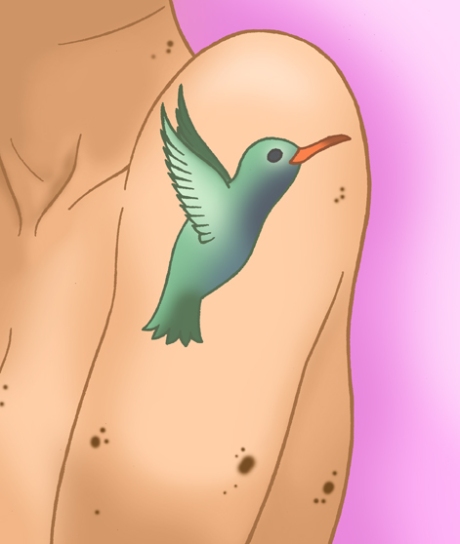
Today’s image is of a hummingbird tattoo, sketched in pen then coloured in Photoshop, and I was trying to experiment with shading fleshtones:

Hummingbird Tattoo 21-10-13

This was rather tricky to do but I’m pretty happy with how it’s come out; the gradients of colour are just as I’d hoped they’d be, although I have to admit that having a photo of my own arm in this position helped enormously to making this work. It’s really satisfying when an image comes out just as I’d pictured it in my head.

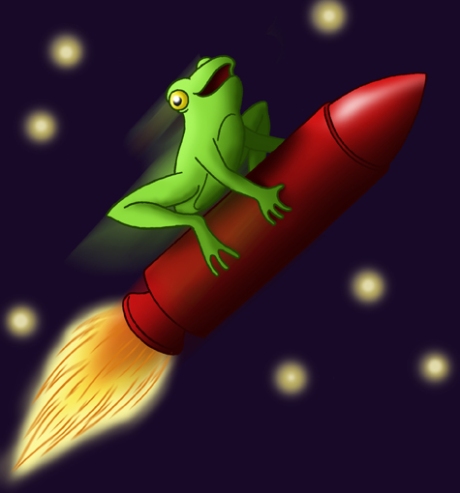
I found a story earlier today about a frog that got caught up in a NASA rocket launch. The accompanying photo is incredible; sad to say though, and rather unsurprisingly, the frog didn’t have a particularly happy ending. I have sought to remedy this with the following picture:

Rocket Frog 17-10-13

The thing I love about doing this blog is that I never know exactly what’s going to be published on any given day, and that freedom is quite liberating; certainly I would never have known this time last week that I’d end up drawing a frog on a rocket, but the idea was too good to waste. I’m pretty happy with the colouring on this one, and I love the expression on the frog; the more I look at it the cuter it becomes.


As promised yesterday this multiple post should bring us back up to date, starting with Saturday 12th and coming up to today.

Saturday’s drawing was a pen-and-Photoshop inspired by the notion of musical cheese; I thought that it would be funny if cheesy music were played on something that reflected the content:

MPCheese 12-10-13I really love the colours on this, it’s pretty simple but more effective for it.


Sunday 13th’s image was inspired by my new hobby; I’ve started a band with a few friends and it’s a lot of fun. It’s the most I’ve played guitar in a long time and the after-effects are presenting themselves, so it led to this refined pen drawing:

Guitar Fingers 13-10-13


I like the simplicity of this one; it gets the sense of wear across rather neatly.


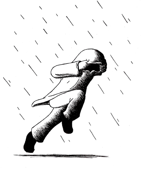
Monday 14th’s image was a pen sketch borne out of the recent heavy rainfall we’ve had. In my job in the last week I’ve seen a lot of people coming in to escape the weather and I’ve been similarly caught out, leading to the figure below:

Rain Escape 14-10-13


I think the black-and-white suits it quite well, but while I’m fairly happy with the figure’s stance (the sense of urgency particularly comes over), I think I may have overshaded the innards of the hood.


Yesterday’s image was inspired by odd-eyed cats. I think there’s something strange and beautiful about that look:

Odd Eyes 15-10-13


I’m rather happy with the shading on this one. I just wish it were a little larger.


Today’s image is a bit of fun typography based on ‘mwah, mwah’ air-kissing, drawn in Sharpie then computer-refined:

Mwah Mwah 16-10-13I’m pretty happy with this one as it was much more of a test with typography than the stuff I normally do. The form suits it really nicely; it looks like a lipstick print but the phrase is pretty clear.


Without going into too much detail out of respect for other people, last week was rather difficult. Drawing helped to provide an escape; because there’s a lot to catch up on, I’m going to do two block entries.

Last Monday’s (7th October) image was inspired by Game of Thrones, a series I got into in a big way this year, and is a return to Rorschach patterning with this direwolf:

Direwolf Rorschach 7-10-13

I’d intended it so that, owing to the nature of the series, it would look like it ought to be on a standard or banner. Originally this had been a pencil drawing, which I refined in Photoshop; in retrospect I rather with I’d used more than one shade of grey but I’m rather pleased with the shape, and the rough edges add to the feel.

Tuesday 8th’s entry was a typographic image inspired by a piece of military slang – Charlie Foxtrot is the NATO Phonetic abbreviation for ‘cluster-f**k’. I thought there was something about Charlie Foxtrot that had a neat ring to it, and wanted to find a way to make attractive a euphemism for a somewhat unpleasant term:

Charlie Foxtrot 8-10-13

I think there’s something about this that looks like it ought to be a logo for something, which partly is why I tilted it – the other reason is to emphasise the meaning of something gone wrong. I like the letterforms; I do wonder if I should have done something more with the colour.

Wednesday 9th’s image is another swirl pattern based on the literary and philosophical tradition of four temperaments – melancholic (black), sanguine (red), choleric (yellow) and phlegmatic (green):

Four Temperaments 9-10-13

While the pattern itself is quite good it may have benefited more from depth of shading. I can’t help thinking this would have worked just as well as a representation of CMYK. I think next time I do a swirl I should go for a feel other than liquid to test myself more.

Thursday 10th’s image was much simpler, a praying mantis:

Praying Mantis 10-10-13

I believe this is the second time I’ve rendered an insect in this fashion (the first being a snail) and it makes for a nice change. Somehow it still has the same inquisitive look as the others.

Friday 11th’s entry was a shell in Sharpie and pencil:

Shell 11-10-13

I like the textural feel to this one. I do wonder if I should have put more patterning but the colour’s vivid enough as it is.